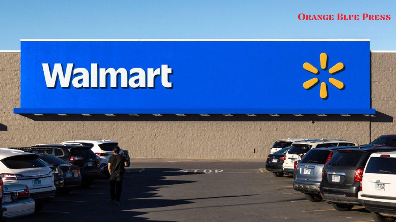
Walmart has recently unveiled an exciting new logo, marking a significant change after almost 20 years. This refresh incorporates fresh design elements inspired by the company’s founder, Sam Walton, and aims to better connect with today’s shoppers. The new logo features bolder letters and a darker blue hue, alongside enhanced details of the beloved yellow spark that has become synonymous with the retail giant. This change is not just about looks; it aligns with Walmart’s ambitions in the digital marketplace as they prepare for a rollout starting in January 2025.
Exciting New Look for Customers
The major redesign, announced recently, showcases a thicker, chunkier typeface that shifts away from the more understated style of the past. Walmart’s Chief Marketing Officer, William White, notes that this new visual identity reflects the company’s evolution as a modern digital retailer, aiming to attract a wider range of customers. Especially with higher-income shoppers, Walmart is keen to present itself as a vibrant and contemporary shopping destination.
Inspiration Behind the Refresh
Interestingly, the new logo takes its cue from Sam Walton’s iconic trucker hat, a nod to the company’s roots and its commitment to serving everyday Americans. The bold letters not only make the store name pop but also echo the spirit of accessibility and warmth that shoppers have come to cherish. White emphasizes this essence, stating that the updated logo is meant to echo Walmart’s foundational principles while bringing a more modern feel to the brand.
Critical Timing with Strong Sales
This logo refresh comes at a time when Walmart posted impressive third-quarter revenues of $169.6 billion, comfortably exceeding Wall Street’s expectations. Such positive financial results showcase the company’s adaptability while tapping into the digital shopping experience that has surged since the pandemic. Walmart’s recent pivot towards e-commerce highlights its commitment to staying relevant in an ever-changing market.
Rollout Plans
Starting in January 2025, customers will see the fresh logo across Walmart’s website, mobile app, and on over 10,500 physical stores worldwide. This plan not only marks a visual shift but is also part of a larger strategy to improve brand credibility among consumers. Across platforms, the updated logo signifies Walmart’s ongoing commitment toward digital-first services and connecting with its shoppers in a more meaningful way.
Community Reactions to the Refresh
As with any major change, social media users have shared their thoughts, with opinions divided between excitement and nostalgia for the previous logo. Many appreciate the new look’s boldness, while others wistfully recall the logo that has been a part of so many shopping experiences over the decades. This blend of fresh identity amid affection for the past reflects how important Walmart is in the lives of millions of customers.
The Path Ahead for Walmart
Looking ahead, Walmart aims to enhance its digital offerings and expand its connection to customers emotionally. The refreshed logo is just one element of a greater strategy to improve the shopping experience, making it easier for customers to shop both online and in-store. Walmart understands that staying relevant in today’s market requires both a fresh look and a deeper connection to what shoppers truly need.
| Previous Logo | New Logo |
|---|---|
| Traditional Typeface | Bolder, Chunkier Typeface |
| Lighter Blue | Darker Blue |
| Basic Yellow Spark | Enhanced, Vibrant Yellow Spark |


